Launching AHP’s Inaugural Invitational Print Swap

This year has already been a milestone one for me. In March I stepped into the role of Chair of the Association of Handcraft Printers (AHP), and since then our new committee has been working with real purpose and excitement. We’ve drafted a 10‑year strategic plan, begun the rebuild of our website, and opened a members‑only Substack to share international print news, opportunities, and equipment for sale.

Now we’re ready to launch something I’m especially proud of:

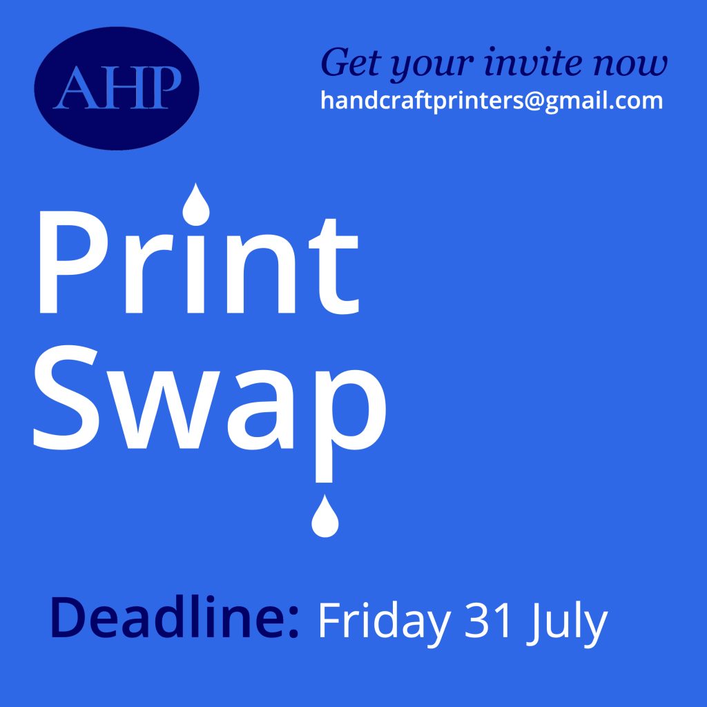
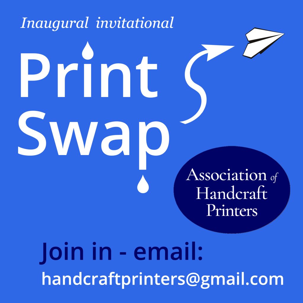
AHP’s first national invitational print swap.

This project has been designed as a lively, low‑barrier way to bring printers together — a chance to swap, share, and enjoy each other’s work. As the invitation says, it’s “a lively, low-barrier project designed to connect printers, spark creativity, and showcase the breadth of letterpress and relief printing in Aotearoa.”

Whether you’re a seasoned letterpress printer, a relief printmaker, or someone quietly working away in a community studio, this is your moment to join in.
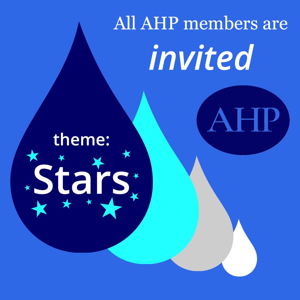
Theme: Stars

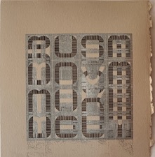
The theme for this inaugural swap is intentionally broad, generous, and full of possibility. As the brief explains, Stars can be read literally — “a chosen constellation, the Southern Cross, a favourite star sign” — or interpreted through the language of letterpress itself, using ornaments, motifs, and symbolic forms. It can also be taken “in more poetic or metaphorical directions: patterns, navigation, guidance, celebration, or simply ‘light in the dark’.”

In other words: follow your instincts. Celestial, typographic, abstract, or deeply personal — all approaches are welcome.

What You’ll Create

Each participant will produce:

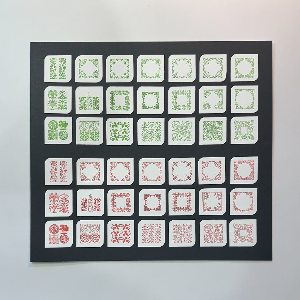
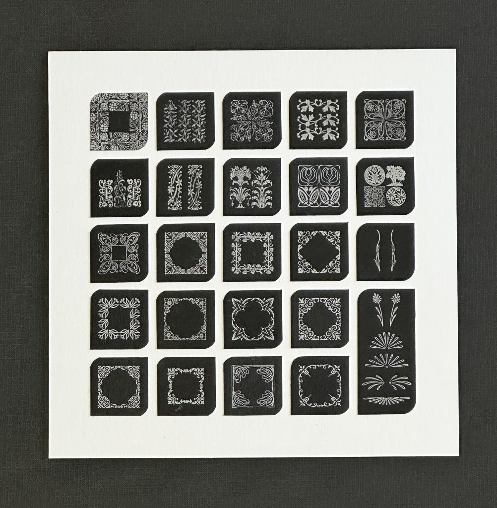
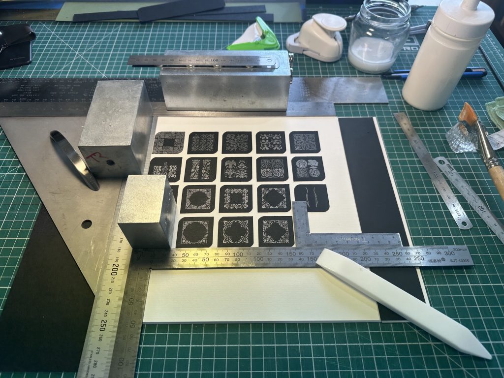
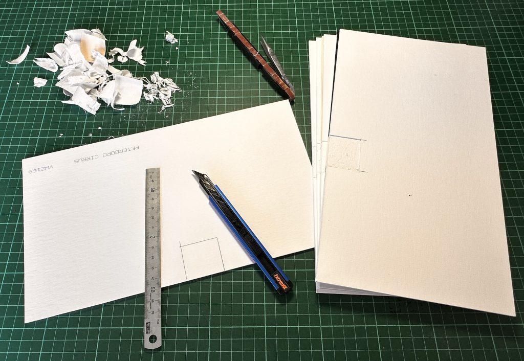
  • 10 prints — editioned or unique
  • A5 size — portrait or landscape
  • Printed on quality paper (120gsm or above)
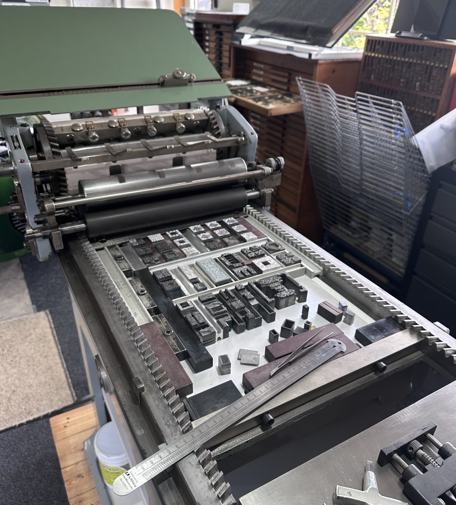
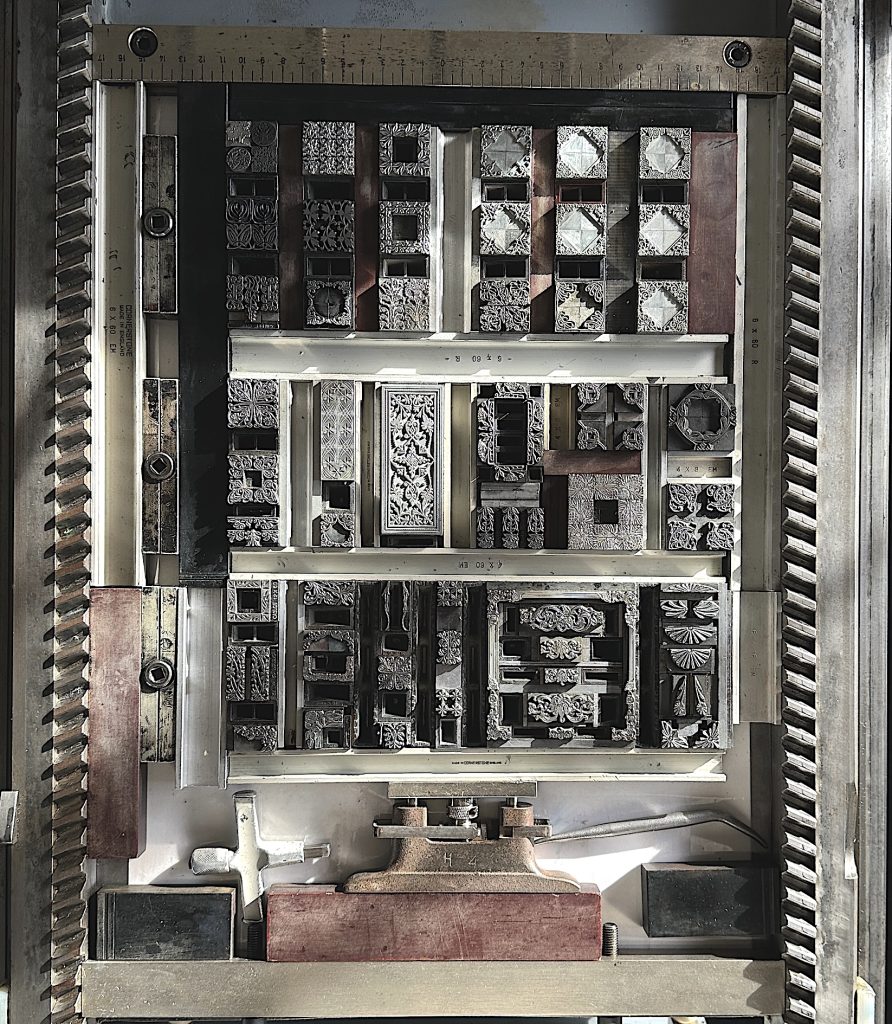
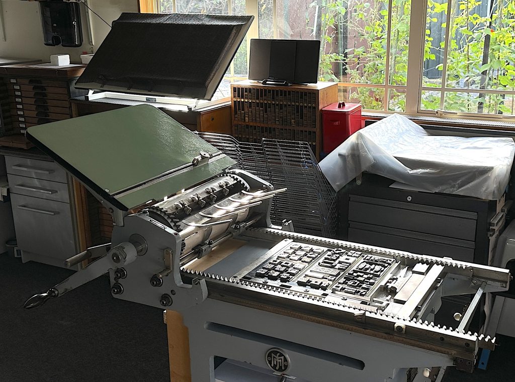
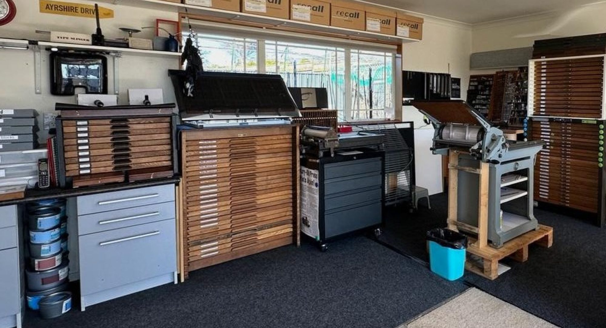
  • Any letterpress or relief method
  • Responding to the theme: Stars

On the back of each print (in pencil), please include your name, region, social media IDs, and printing method.

What You’ll Send

Please package:

  • Your 10 prints
  • A self‑addressed, pre‑paid postage bag (A5 or larger)
  • Optional: a short note

AHP will coordinate the swap, collation, and return.

What You’ll Receive

Once all prints are collated, you’ll receive:

  • 9 prints randomly selected from printers across the country
  • A diverse mix of styles, voices, and techniques
  • Delivered in your own pre‑paid postage bag

One of your prints will be set aside for exhibition and fundraising.

Exhibition & Wayzgoose Fundraiser

AHP will:

  • Scan and exhibit a selection of prints on the AHP website
  • Prepare one print from each participant for sale at the August Wayzgoose
  • Use proceeds to help offset project costs
  • Auction any unsold prints at the Wayzgoose dinner in September

This helps keep the swap sustainable and supports future AHP projects.

Key Dates

  • Swap runs: May–July 2026
  • Final delivery deadline: Friday 31 July
  • Website exhibition + sales: August Wayzgoose

To take part, simply email handcraftprinters@gmail.com and we’ll confirm your place and send you the Collator’s address.

Why This Matters

Print swaps have long been a beloved tradition in the global printmaking community — a way to share work, build friendships, and celebrate the craft. For AHP, this inaugural swap marks the beginning of a new chapter: one that’s more connected, more visible, and more ambitious.

If you’re curious about AHP, this is the perfect way to dip your toes in. And if you’d like to support the kaupapa more fully, membership is just $20 per year. Every new member strengthens the community we’re building.

Let’s make this first swap vibrant, welcoming, and full of the joy of ink on paper — “a chance to swap, share, and enjoy.”

Responding to Love letters 2026

This year’s Love Letters Botanica 2026 exhibition invited printers across Aotearoa to explore the botanical world through relief‑printed text and imagery. It’s a theme that feels wonderfully aligned with my own practice, so I’m delighted to share my two submissions—both titled Just My Type.

Just My Type — Botanical Selection on Crane Lettra

Printed in green and red on 300gsm Crane Lettra white, this piece brings together a curated selection of small botanical and floral motifs. Each element is hand‑set and hand‑inked on my Korrex Stuttgart cylinder proofing press, drawn from my wider collection of borders, ornaments, florettes, and decorative typographic details.

Just My Type — Silver on Crane Wild Black

The companion piece explores the same ornamental vocabulary but shifts the mood entirely. Printed in silver ink on 300gsm Crane Wild black, it highlights the sculptural quality of letterpress impression—light catching on raised forms, pattern emerging from darkness.

Behind the Printing Process

Alongside the finished prints, I’m sharing a few photographs from the press bed to show how each motif was composed and locked up for printing. Every square began as a small arrangement of metal ornaments—borders, florettes, corner pieces—brought together on the bed of my Korrex Stuttgart. There’s something deeply satisfying about seeing these tiny elements held in tension, ready to transfer their form to paper with one clean pass of the cylinder.

Shaping the Leaf Forms

Once printed, each motif was hand cut and then cornered on opposing corners to create a stylised leaf shape. This small intervention transformed the squares from simple samples into something more sculptural and botanical. The cutting process became its own quiet rhythm: measure, trim, corner, repeat. It’s a reminder of how much of letterpress lives beyond the press itself—in the handling, shaping, and finishing that give each piece its final character.

Exploring Variations

Preparing work for this exhibition led me to print far more variations than I ultimately submitted. Different sizes, shapes, combinations, and colourways emerged as I worked, and the process opened up some exciting new directions. These small botanical squares—each just 35 × 35 mm—have become a kind of modular language, full of potential for future projects.

Commission Possibilities

If these motifs or the approach resonate with you, I would be very interested in discussing commissioned projects that make use of these ornamental prints. I’m especially drawn to:

  • Artists’ books
  • Book‑form structures
  • Three‑dimensional sculptural pieces

Projects where typography, pattern, and form can interact in unexpected ways are where this work truly comes alive.

If you have an idea you’d like to explore—or would like to see some of the unused variations—please feel free to get in touch.

@loveletters_letterpress  #lovelettersnz2026 #letterpress #letterpressprinting

Two new No Adhesive Bindings added to my Workshop Series

I’m delighted to add two new bindings to my IMPRIMO workshop series—both beautifully engineered, both achievable in a single day, and both requiring no adhesive and no sewing. These structures rely on thoughtful folding, precise cutting, and the satisfying mechanics of the piano hinge concept. They open flat, can be made reversible, and work equally well with or without hard covers.

They’re also wonderfully adaptable. With a little imagination and a good choice of materials, each binding becomes a platform for striking visual design.

Why these bindings are ideal for workshops

  • No glue, no stitching — simple tools and clean processes
  • One day completion — participants leave with a finished book
  • Open flat — excellent for artists’ books, visual journals, and display formats
  • Creative potential — perfect for exploring colour, texture, and material contrasts
  • Reversible.
  1. Accordion Piano Hinge Binding
    (also known as the flat style Australian reverse piano binding)
    This elegant structure uses an accordion folded spine paired with inserted “hinge” strips to lock the pages together. The result is a surprisingly strong, flexible book that opens perfectly flat. Because the hinge strips can be made from contrasting papers, the binding becomes a design feature in its own right.

It’s an excellent introduction to hinge based structures and a satisfying project for beginners and experienced makers alike.

  1. Piano Hinge Binding Variation
    (created by Hedi Kyle and described by Keith Smith)
    This variation takes the classic piano hinge idea and reimagines it with Hedi Kyle’s characteristic ingenuity. The structure is simple to construct yet full of possibility: pages interlock through alternating slots and tabs, creating a rhythmic spine that invites experimentation with colour, pattern, and form.

Ready for Your Group, Studio, or Event
Both bindings are excellent choices for community groups, book arts gatherings, schools, and anyone curious about exploring structure without the complication of adhesives or stitching. If you’re interested in hosting a workshop, I’m very happy to teach and tailor the session to your group’s needs.

The organising side of things — arranging a venue, managing registrations, and gathering participants — sits with the host, while I focus on delivering the workshop itself.

World Book Night 2026: Rūaumoko Rising

This year’s World Book Night theme, The Mountains Are Calling, immediately pulled me toward Aotearoa’s deep geological and cultural layers. Instead of choosing a traditional mountain text, I found myself absorbed in a technical paper: Rūaumoko: More than just a symbol by N. Taute, T. Fa’aui and J.M. Ingham from the University of Auckland’s Department of Civil and Environmental Engineering. Their exploration of Rūaumoko as both atua and earth‑shaping force offered a powerful way to think about mountains not as static forms, but as living, shifting presences.

That duality—cultural story and geological reality—became the heart of my 3D contribution.

Concept

I wanted to create something that felt like a book, a map, and a small act of movement all at once. The structure folds flat to fit the A5 brief, but opens along the fault line that runs through Aotearoa. The opening itself becomes an echo of tectonic motion: the land parting, the story revealing itself.

The front cover holds a map of New Zealand with the fault line marked—our slice of the Pacific Ring of Fire. The closure of the book sits directly on that line, so the act of opening the work mirrors the forces beneath our feet.

The back expands the view to the wider Pacific, showing the full Ring of Fire encircling the ocean. It felt important to place Aotearoa within that larger context, acknowledging that our mountains, volcanoes, and earthquakes are part of a vast, interconnected system.

 Inside the Work

Opening the structure reveals a pop‑up volcano rising from the centre. Around it spirals the creation story of Rūaumoko—atua of earthquakes, volcanoes, and the seasons—whose restless movement shapes the land from below. The text encircles the volcano like a pulse, reminding us that stories and science often describe the same forces in different languages.

This interplay between engineering paper and pūrākau became the guiding thread: two knowledge systems, both explaining why the ground moves and mountains grow.

Process

I’ll be sharing two photos alongside this post:

  • my yellow‑and‑red prototype, where I worked out the mechanics and proportions
  • the final orange‑and‑red version, where the colours echo heat, magma, and the energy of Rūaumoko

The pop‑up engineering was its own small challenge—balancing height, foldability, and the need to collapse neatly into an A5 envelope. The final structure opens cleanly and stands firmly, which feels like a small triumph given the constraints.

About World Book Night 2026

This year’s brief invited artists to respond to a text about mountains, creating a 2D or 3D work that folds flat for mailing. Organised by Sarah Bodman and Linda Parr with input from Nancy Campbell, WBN brings together artists from around the world for an exhibition, mail art swap, and online gallery. All works will be shown at Bower Ashton Library, UWE Bristol, from April to July 2026.

I love participating each year—there’s something special about sending a piece of work out into the world and receiving another artist’s response in return.

Closing Thoughts

Mountains are often seen as symbols of permanence, but in Aotearoa they are reminders of constant change. Rūaumoko’s presence beneath the land keeps everything in motion. Responding to this theme through both science and story felt like a way to honour that dynamism.

I’m looking forward to seeing the full collection of works when the exhibition opens—and to discovering whose piece will arrive in my mailbox in return.

Festschrift LXXXV — Marking Alan Loney’s 85thFestschrift for Alan Loney

In May 2025, a small group quietly marked a milestone: the 85th birthday of poet, printer, editor, and perennial provocateur of the printed word, Alan Loney. It was an occasion that called for something more than a card or a congratulatory email. Alan has never been a figure who fits tidily into a single category, so a conventional tribute would have felt insufficient. Instead, a group of friends, colleagues, and fellow printers gathered their thoughts, memories, and acknowledgements into a small Festschrift — a form traditionally used in academia, but entirely fitting for someone whose life has been spent at the intersection of scholarship, craft, and creative inquiry.

A Tradition Renewed

Ten years earlier, for Alan’s 75th, Brendan O’Brien coordinated a small foldered set of acknowledgements from five contributors. Around twenty copies were produced, enough for each writer, a few for Alan, and the remainder sold to cover costs.

Ten years later, I felt the impulse to honour Alan again, this time with a wider group and a broader scope.

An Exhibition Without Its Guest of Honour

Alan had planned to travel to Christchurch for the opening of a small exhibition marking 50 years of Hawk Press, curated by Peter Vangioni for the new library and archives display area at the Christchurch City Art Gallery. Medical advice meant he couldn’t attend, but the exhibition went ahead, beautifully installed. In his absence, the Festschrift became a way for the community to gather around him in print.

The Contributors

The eleven contributors reflect the breadth of Alan’s relationships and influence:

Brendan O’Brien (Fernbank Studio)

Dan Tait‑Jamieson (Moana Road Press)

Derek Lamb (Officina Athelstane)

Donald Kerr

John Denny (Puriri Press)

John Holmes (Frayed Frisket Press)

Paul Thompson (Museum Photon Press)

Peter Vangioni (Kōwhai Press)

Riemke Ensing

Tara McLeod (Pear Tree Press)

Terrie Reddish (Imprimo Press)

Pressing On

Festschrift LXXXV is modest in scale but rich in intention. It stands as a collective thank‑you to someone who has spent a lifetime in conversation with the book — its form, its meaning, its possibilities. For those of us who contributed, it was a privilege to acknowledge that ongoing influence in the medium Alan has always championed: print itself.

A Bespoke Portfolio for a Red‑Letter Occasion

To house the eleven contributions, I designed and made a two‑flap portfolio with a red cover — a nod to the “red‑letter” significance of Alan’s 85th. The cover carries a blind‑embossed LXXXV, understated but celebratory.

Only 24 were produced, and five copies remain available.

Making the Portfolios

With the eleven contributions received, the next stage was to create a portfolio that would house them with the care and dignity the project deserved.

1. Collating the Contributions

Once all the pieces arrived, I laid them out across the dining table and collated them into 24 complete sets. This is always a grounding moment — the shift from individual sheets to a coherent body of work.

2. Cutting and Shaping the Boards

Each portfolio is built from several precisely cut pieces of board. Some require additional shaping to accommodate the magnetic closure:

  • the larger left flap, which carries the title,
  • and the smaller right flap, which is notched so the closure tab sits flush.

Accuracy at this stage determines how cleanly everything will align later.

3. Preparing the Embossed LXXXV

The Roman numerals were cut separately, glued to the front board, and left to dry. Once the red cover paper was applied, I used a bone folder to work the paper down around the raised numerals, creating a crisp, understated blind emboss. It’s a small detail, but it gives the portfolio its quiet sense of occasion.

4. Covering the Boards in Red

The boards were then covered in the chosen red paper — a deliberate nod to this “red‑letter” birthday.

The paper is turned in neatly before the inner coverings are applied. At this point, the two neodymium magnets must be positioned with absolute precision and buried within the board layers. If they’re even slightly misaligned, the closure won’t meet cleanly.

5. Infill, Lining, and Foil Stamping

Once the outer structure was complete, I infilled the boards and lined the interior. 

Before final assembly, I hot‑foiled my IMPRIMO logo and name — a small but important signature of origin.

The last internal element is the black two‑flap enclosure, which holds the contributions. This is glued in once all the lining is dry and flat.

6. Drying Time — The Invisible Stage

There is a surprising amount of waiting in a project like this. Adhesive must dry thoroughly between stages, and because both sides of the boards receive adhesive, everything settles flat and true once cured. It’s slow, but essential for a crisp, professional finish.

7. Boxing and Wrapping for Posting

With the portfolios complete, the final task was to ensure they would travel safely. I made custom white foam‑board boxes for each one — fitted, cushioned, and designed to prevent corner damage in transit.

Each boxed portfolio was then wrapped in heavy brown paper, addressed, and sent off to its new home.

Conversations with Alan zine series – Zine No. 3: Type

Over the past decade, my inbox has filled with a steady stream of conversations between Melbourne-based printer, poet, and author Alan Loney and me. What began in 2016 at a Printing Masterclass in Wellington—where Alan was teaching and I was learning—has never really stopped. Those email threads have become a place where I ask questions about whatever I’m working on, and Alan replies with the depth of someone who has spent a lifetime thinking about paper, ink, type, and the craft of printing.

The conversations with Alan zine series grew out of those exchanges. Each issue pairs my questions (set in Open Sans) with Alan’s responses (set in Georgia), inviting anyone who is curious to quietly “listen in” and share the learning.

With the release of Zine No. 3: Type, there are now three titles in the ongoing series:

  1. Paper
  2. Ink
  3. Type

All three are DLE-sized, printed in black and white, with a light card cover and 12 pages. Publishing is infrequent—simply whenever I have the time—so each edition arrives when it’s ready, not on a schedule.

Zine No. 3: Type

This latest edition turns its attention to type, a subject Alan and I return to often. From favourite faces to the realities of “making do,” Alan’s reflections remind us how type shapes both craft and conversation.

This issue also includes a free keepsake, tucked neatly inside the cover but removable. It explains the difference between font and typeface—a distinction printers know well, but one that still sparks lively discussion.

A milestone year for Alan

2025 has been a significant year for Alan:

  • A celebratory Melbourne lunch with publisher Nick Summers and me
  • His 85th birthday, marked by a limited-edition Festschrift (24 copies, with 8 still available)
  • An exhibition curated by Peter Vangioni at Christchurch Art Gallery honouring the fiftieth anniversary of Hawk Press

For those who would like to explore more of Alan’s work, I recommend:

Ordering information

Postage has increased, but I’ve kept the overall price low by turning a practice print into your keepsake. Prices include postage and packing:

RegionPricePayment options
New ZealandNZ$10Online banking*
AustraliaWise NZ$11 / PayPal NZ$12Wise or PayPal
Rest of worldWise NZ$15 / PayPal NZ$17Wise or PayPal

*Online banking: Terrie Reddish — ASB 12-3055-0137745-00

The easiest and cheapest way to pay from overseas is via Wise: https://wise.com/pay/me/terrier5 (Or I can send a payment request.)

I can also accept payments or send invoices via PayPal using my new email address: imprimo@terrie-reddish.co.nz

Previous issues

Issues 1 (Paper) and 2 (Ink) are still available. If you’d like the full set of three, I’m happy to bundle them.

If you’d like to be notified when the next zine is published, I can add you to the mailing list. As always, publication is occasional—just whenever time allows.

NAME PLATES

I was recently commissioned by Chip and Mary McHardy to create a set of door name plates for their historic Aramoana home. With their daughter’s wedding bringing guests into the house, they wanted a simple way to indicate which rooms were private.

Each plate was printed in a single colour—charcoal black—on 600gsm Crane Lettra fluorescent white. I used a 12pt running border with an understated leaf motif, and added curved frond ornaments in an Art Nouveau style on either side. The word “Private” was set in ultra-condensed 84pt ‘Keyboard’ font for clarity and presence.

It was a pleasure to contribute a small detail that supported both hospitality and boundaries.

The unseen sewing

One of the quiet joys of bookbinding repair is the privilege of seeing the “inside” of a book—its structure, its wear, and sometimes, its secrets. I recently helped a bookbinding friend with the sewing portion of a restoration project, a task I always relish. It’s meditative work, and it offers a rare intimacy with the book’s anatomy.

This particular volume was a leather-covered journal, originally sold as a blank book. Over time, it had become a vessel for memory. Someone—or perhaps several people—had filled its pages with fountain pen entries in a graceful, looping script. Among the writings was a vivid account of a sea voyage from London to New Zealand, dated 1855–1856. The author’s reflections, penned with care, turned the journal into a historical artifact, rich with personal narrative and maritime detail.

But the years had not been kind. The spine had broken down through use, and various well-meaning repairs had been made to keep the book block intact and the boards attached. Some pages were held in place with yellowing sticky tape, a common but unfortunate fix that had begun to stain and stiffen the paper.

My role was to gently undo those interventions. I removed the tape and replaced it with Japanese tissue—a much more sympathetic material that allows flexibility and longevity. Once the pages were stabilised, I resewed the signatures onto raime tapes, preparing the book for its next phase: reattaching the boards and restoring its structure.

It’s always satisfying to return a book to useable form, especially one that carries such a personal and historical weight. And for me, the sewing is more than a technical step—it’s a way of connecting with the book’s past and ensuring its future.

Antidote to doomscrolling

10 x 10 x 10: My Contribution to PCANZ’s Antidote to Doomscrolling

This spring, I joined a collective of 72 printmakers across the motu in the Print Council of Aotearoa New Zealand’s 10 x 10 x 10 print exchange—a member-led project designed as an “antidote to doomscrolling.” The idea is simple and generous: each participant creates ten prints, each 10 x 10 cm, and receives a curated selection of prints from other regions in return. It’s a tactile, thoughtful way to connect through ink and paper.

My print: from Doom to Antidote

For my contribution, I created a two-colour print using letterpress techniques. The background features the word doom printed in black ink—an acknowledgment of the digital overwhelm many of us feel. Overlaid in bronze ink are four antidote words:

muse · move · make · meet

Each one offers a counterpoint to doom, a small invitation to re-engage with creativity, motion, making, and connection.

I printed on 250gsm fawn Legion Stonehenge paper. The bronze ink catches the light just enough to suggest possibility, while the black anchors the piece.

The process

Designing for a 10 x 10 cm format was deceptively challenging. I started with several ideas—discarded most—and eventually committed to this layered approach. Like many printmakers, I’m my own worst critic, but I’ve come to appreciate the happy accidents and quiet decisions that emerge in the studio.

DOOM type is ‘linear’ characters
American Type Founders Alpha-Blox
Trial with 18pt brass type and hot foil
Antidotes are in ‘reverse’ characters
American Type Founders Alpha-Blox
in orange ink
Antidotes are in ‘reverse’ characters
American Type Founders Alpha-Blox
in red ink
Antidotes are in ‘reverse’ characters
American Type Founders Alpha-Blox
in silver ink

Reflections

This project has reminded me that printmaking is not just about ink and paper—it’s about community, intention, and shared momentum. Whether you’re a seasoned printmaker or just starting out, the invitation is the same: get inky, enjoy the process, and connect.

You can learn more about the exchange on the PCANZ website, or follow along on social media using the hashtag #pcanzantidote.

Ngā mihi nui to Nicki Frances for coordinating this generous project, and to all the printmakers who are part of it.

Just my type

JUST MY TYPE looks and functions like a book. It has all the structural elements of a book and is created with all the traditional equipment of the letterpress printer and bookbinder. I wanted to create both a useful tool and a beautiful art object.

thinking…
I often find myself thinking about what typeface/ font/ point size to use in my letterpress printing. Computer mock-ups are never quite the same as printing with cast metal and wood type. I wanted actual printed examples (type samplers) of the different fonts and point sizes for each typeface.

unfolding…
I needed to create a folded paper structure that would present the sampler cards in a way they could be removed and returned, seen and yet protected. Then I read Hedi Kyle’s new book, Art of the Fold, and saw a variety of pocket accordion structures.

binding…
Monique Lallier’s New Oriental binding seemed the perfect way to bind the modified pockets which I had sewn on to folded stubs of paper (inner spine). The resulting book displays a range of type samplers when either lying on its substantial spine or standing with the aid of the leather covered boards.

Cover