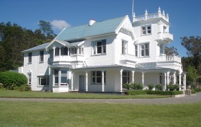
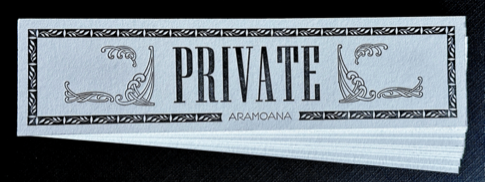
I was recently commissioned by Chip and Mary McHardy to create a set of door name plates for their historic Aramoana home. With their daughter’s wedding bringing guests into the house, they wanted a simple way to indicate which rooms were private.
Each plate was printed in a single colour—charcoal black—on 600gsm Crane Lettra fluorescent white. I used a 12pt running border with an understated leaf motif, and added curved frond ornaments in an Art Nouveau style on either side. The word “Private” was set in ultra-condensed 84pt ‘Keyboard’ font for clarity and presence.
It was a pleasure to contribute a small detail that supported both hospitality and boundaries.
10 x 10 x 10: My Contribution to PCANZ’s Antidote to Doomscrolling
This spring, I joined a collective of 72 printmakers across the motu in the Print Council of Aotearoa New Zealand’s 10 x 10 x 10 print exchange—a member-led project designed as an “antidote to doomscrolling.” The idea is simple and generous: each participant creates ten prints, each 10 x 10 cm, and receives a curated selection of prints from other regions in return. It’s a tactile, thoughtful way to connect through ink and paper.
My print: from Doom to Antidote
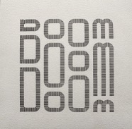
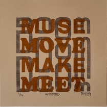
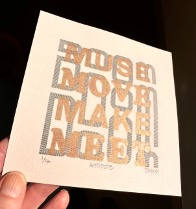
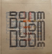
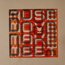
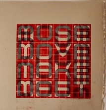
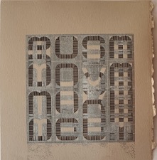
For my contribution, I created a two-colour print using letterpress techniques. The background features the word doom printed in black ink—an acknowledgment of the digital overwhelm many of us feel. Overlaid in bronze ink are four antidote words:
muse · move · make · meet
Each one offers a counterpoint to doom, a small invitation to re-engage with creativity, motion, making, and connection.
I printed on 250gsm fawn Legion Stonehenge paper. The bronze ink catches the light just enough to suggest possibility, while the black anchors the piece.
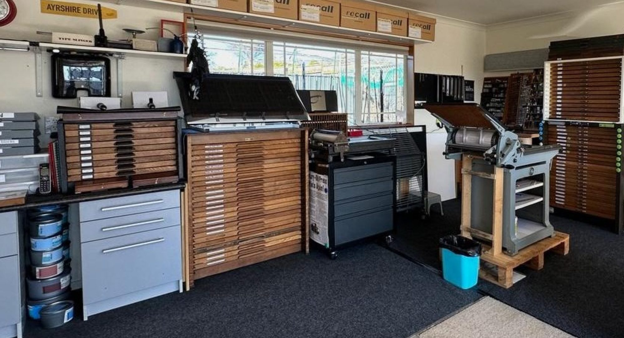
The process
Designing for a 10 x 10 cm format was deceptively challenging. I started with several ideas—discarded most—and eventually committed to this layered approach. Like many printmakers, I’m my own worst critic, but I’ve come to appreciate the happy accidents and quiet decisions that emerge in the studio.
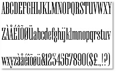
DOOM type is ‘linear’ characters American Type Founders Alpha-Blox Trial with 18pt brass type and hot foilAntidotes are in ‘reverse’ characters American Type Founders Alpha-Blox in orange inkAntidotes are in ‘reverse’ characters American Type Founders Alpha-Blox in red inkAntidotes are in ‘reverse’ characters American Type Founders Alpha-Blox in silver ink
Reflections
This project has reminded me that printmaking is not just about ink and paper—it’s about community, intention, and shared momentum. Whether you’re a seasoned printmaker or just starting out, the invitation is the same: get inky, enjoy the process, and connect.
You can learn more about the exchange on the PCANZ website, or follow along on social media using the hashtag #pcanzantidote.
Ngā mihi nui to Nicki Frances for coordinating this generous project, and to all the printmakers who are part of it.
Manage Consent
We use cookies to optimise our website and our service.
Functional
Always active
The technical storage or access is strictly necessary for the legitimate purpose of enabling the use of a specific service explicitly requested by the subscriber or user, or for the sole purpose of carrying out the transmission of a communication over an electronic communications network.
Preferences
The technical storage or access is necessary for the legitimate purpose of storing preferences that are not requested by the subscriber or user.
Statistics
The technical storage or access that is used exclusively for statistical purposes.The technical storage or access that is used exclusively for anonymous statistical purposes. Without a subpoena, voluntary compliance on the part of your Internet Service Provider, or additional records from a third party, information stored or retrieved for this purpose alone cannot usually be used to identify you.
Marketing
The technical storage or access is required to create user profiles to send advertising, or to track the user on a website or across several websites for similar marketing purposes.